Nick The Handyman
Services: Brand Identity
Year: 2025
Nick has worked in the construction industry for over 20 years as a self-employed handyman, serving a wide range of clients across the Hampshire area.
As the market became increasingly competitive, his existing visual identity was getting lost in the noise—surrounded by dozens of similar-looking competitors. He needed a brand that felt modern, distinctive, and professional—something that would help him stand out.
During research, we noticed a common trend: many local tradespeople relied on similar visual tropes—blue colour palettes, generic tool icons, and typical house imagery. While these choices clearly communicated the industry, they lacked originality and failed to convey long-term quality.
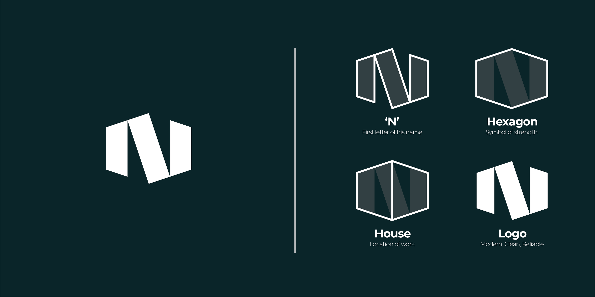
Through conversations with Nick, we learned that his work had a reputation for lasting quality—his craftsmanship was known to outlast others in the area. That insight led us to an idea: some of the strongest materials on Earth share a common structure—the hexagon. What if we could incorporate this into a design?
We developed a concept that combined the letter ‘N’ with the hexagon shape, while maintaining strong visual balance. The final design also subtly suggests a two-point perspective building, nodding back to his roots in home construction.
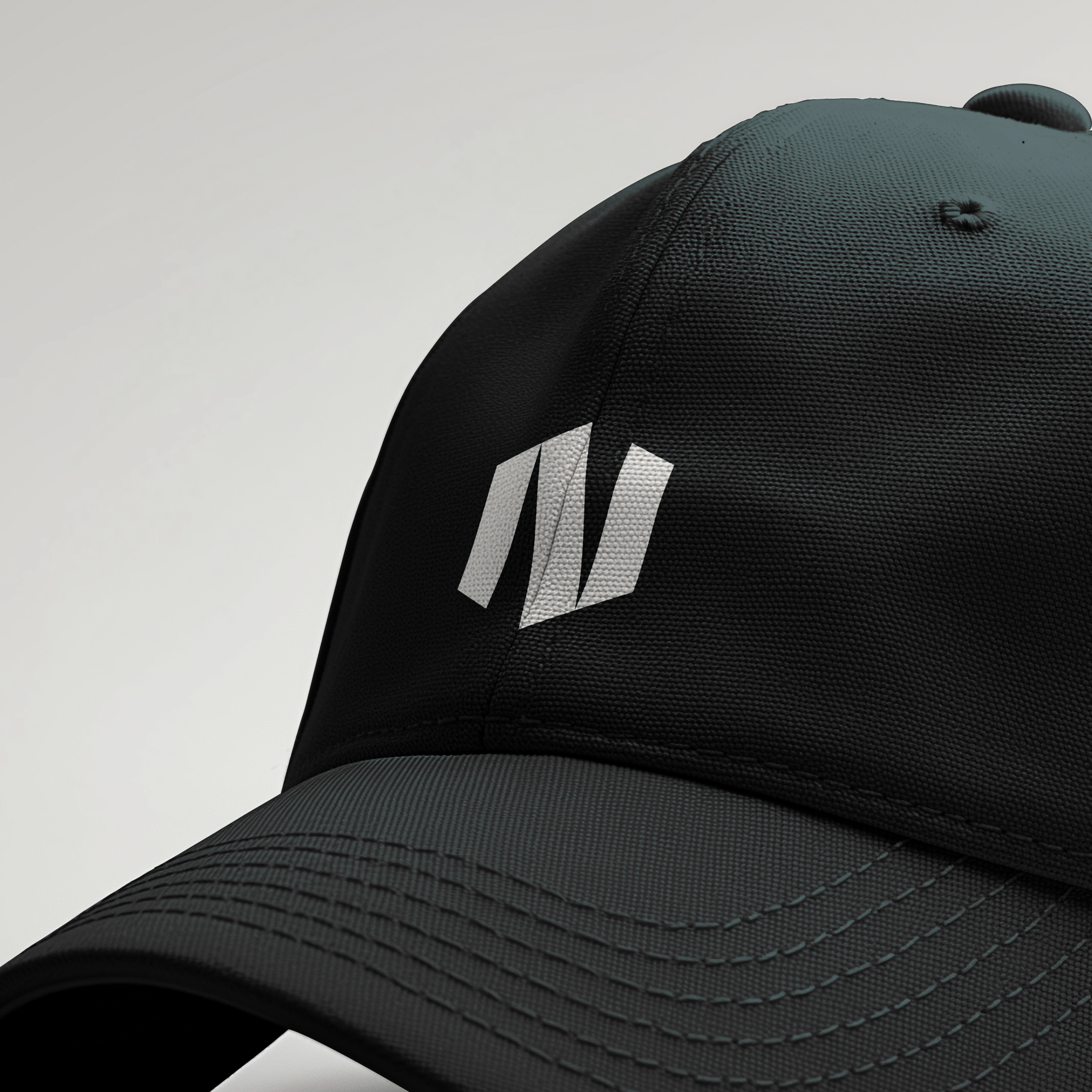
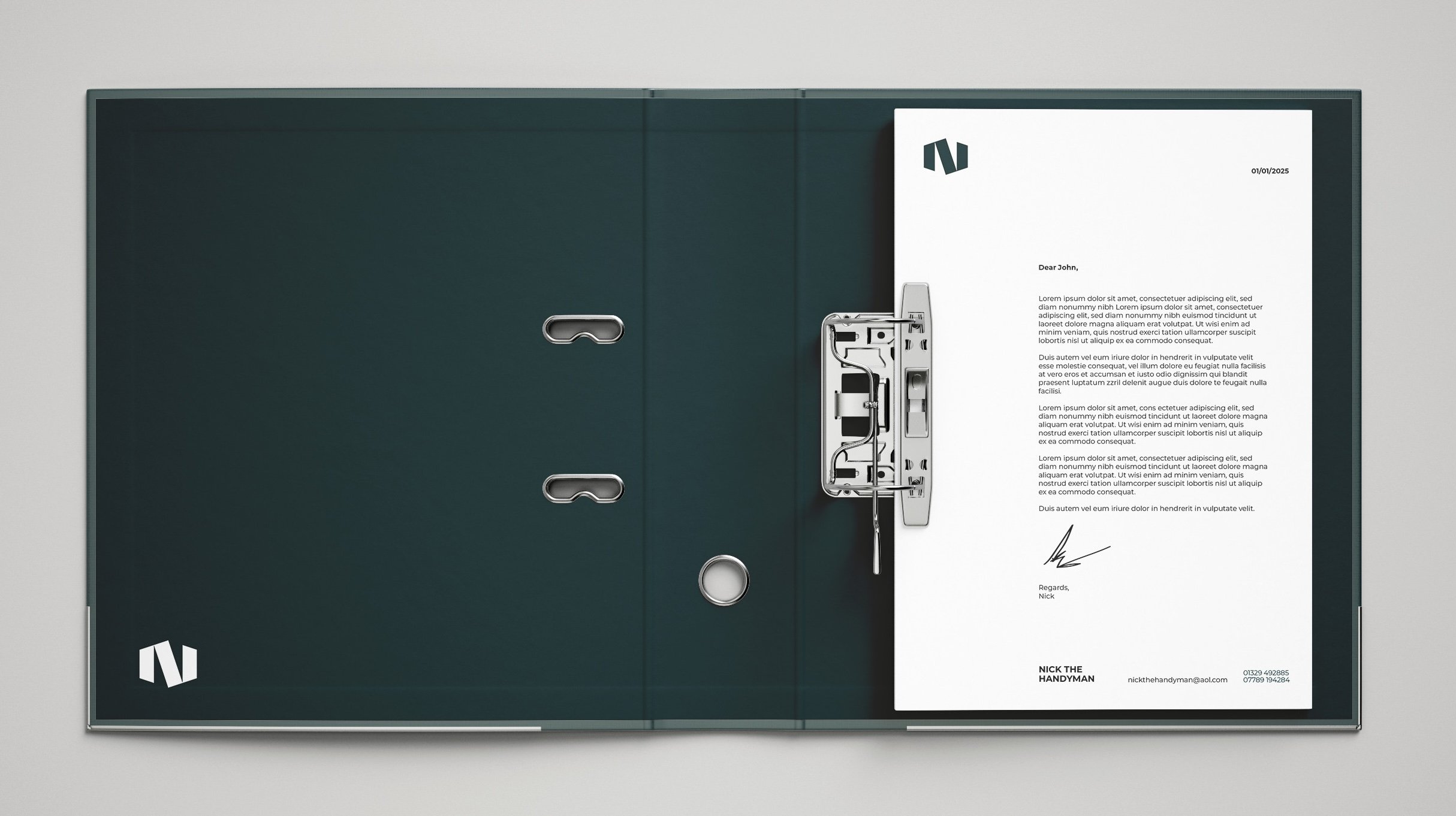
We opted for a deep blue, which still retains the same colour he was using previously, but the saturation of his original design was too high (and also clashed easily with competitiors). The resulting identity is clean, modern, and versatile—designed to work across applications from business cards to vehicle graphics. It stands confidently on its own and can easily evolve into a broader brand system should Nick decide to expand in future.


